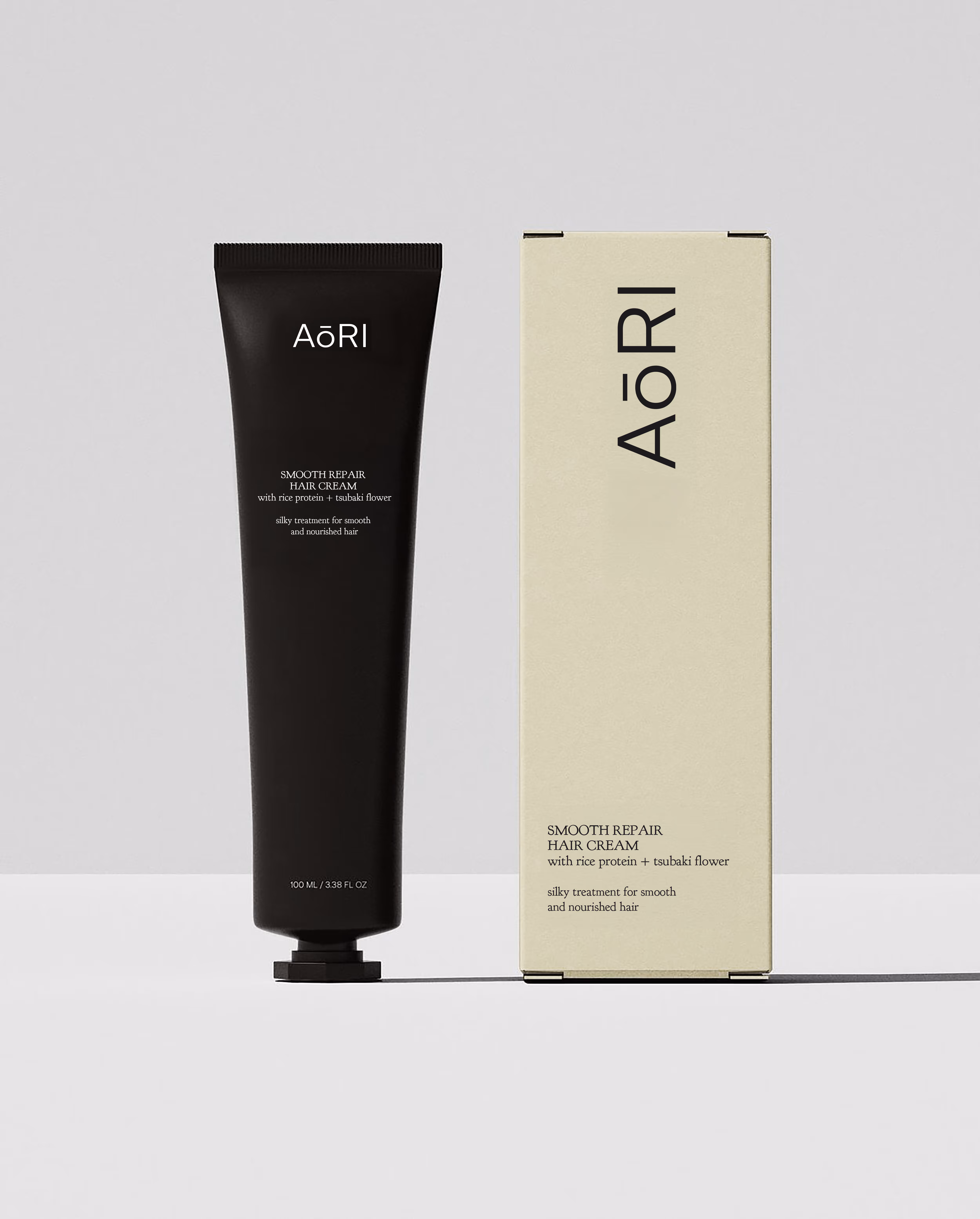
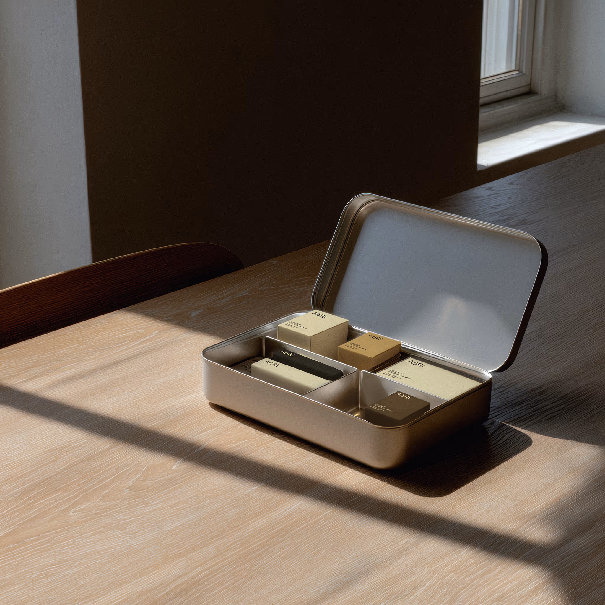
This brand identity was developed for a product line rooted in traditional Japanese natural ingredients. The visual direction draws on Japanese aesthetics while clearly expressing the natural origin of the formulas. The logo was designed using elongated dashes that subtly evoke the long vowels found in Japanese writing, resulting in a minimal yet distinctive mark. For the typography, the identity combines a serif typeface inspired by 1920s fonts, chosen to bring an elegant, timeless touch, with a clean and highly legible sans serif used for more technical descriptions. This pairing creates a refined balance between sophistication and clarity. The colour palette blends tones drawn from Japanese visual culture with natural, earthy hues, reinforcing both the brand’s origins and its focus on organic ingredients.
Fonts used: League Spartan by The League of Moveable Type (GitHub), licensed under the SIL Open Font License 1.1; and Le Murmure by Jérémy Landes, distributed by velvetyne.fr.